Adaptive web design with React
When you need to develop a website that provides a good user experience on desktop and mobile there is only so much you can accomplish using responsive grids. I’ve used a number of grids systems using various frameworks and currently my responsive grid of choice is XY Grid (depending on browser flex box support requirements) which is part of Foundation 6.
Unfortunately XY Grid is not made available as a separate npm package so you have to add Foundation Sites but thankfully they make it easy to only import XY Grid using SASS imports.
-
Add Foundation Sites
yarn add foundation-sites -
To import SASS files with Create React App, you need to install node-sass
yarn add node-sass --dev -
Then rename the ‘App.css’ file generated by Create React App to ‘App.scss’ and add the following lines:
/* Import Foundation XY Grid */ @import "node_modules/foundation-sites/scss/foundation.scss"; @include foundation-xy-grid-classes( $base-grid: true, $margin-grid: true, $padding-grid: true, $block-grid: true, $collapse: true, $offset: true, $vertical-grid: true, $frame-grid: true ); @include foundation-visibility-classes; @include foundation-flex-classes; -
Finally, remember to update any css imports in the ‘App.js’ file from ‘.css’ to ‘.scss’
import "./App.scss";
After this it’s just a case of adding the XY Grid class names to your JSX markup. You can also utilize the flexbox helper classes to change source ordering and the visibility helper classes to show or hide content for certain screen sizes.
As mentioned earlier there are conditions where a grid class on its own won’t solve every responsive design problem specifically in cases when you need to resize a React child component that requires an exact width or height prop in order to render correctly. In this case you may need to wrap that component with a React Resize Detector to render to component on resize event.
yarn add react-resize-detector
Adaptive UI
When it comes to selecting a UI kit for React apps Material UI provides a good number of components, which can be themed.
yarn add @material-ui/core
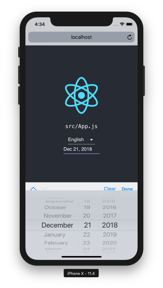
Material UI Select components and custom date pickers can provide a great experience on desktop using a mouse, but I find they can run into a number of UX issues on mobile. I think this could be one of the reasons the Material UI Picker docs mention there are falling back to native input controls. But whilst the experience of native pickers is optimal on mobile, it’s not widely available on desktop yet. Also, web designers have little control over how it looks on desktop at the minute, so if your site uses a dark theme it may look inconsistent in terms of design.
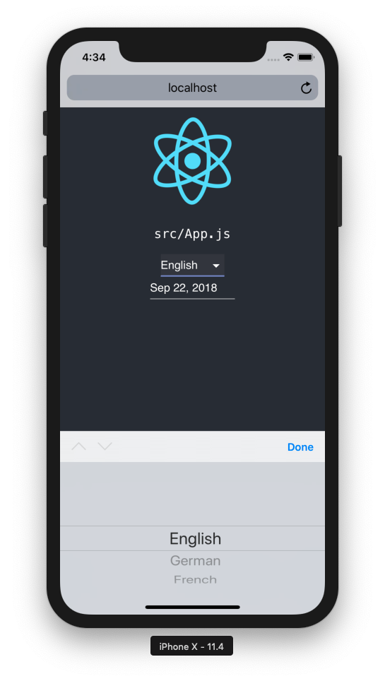
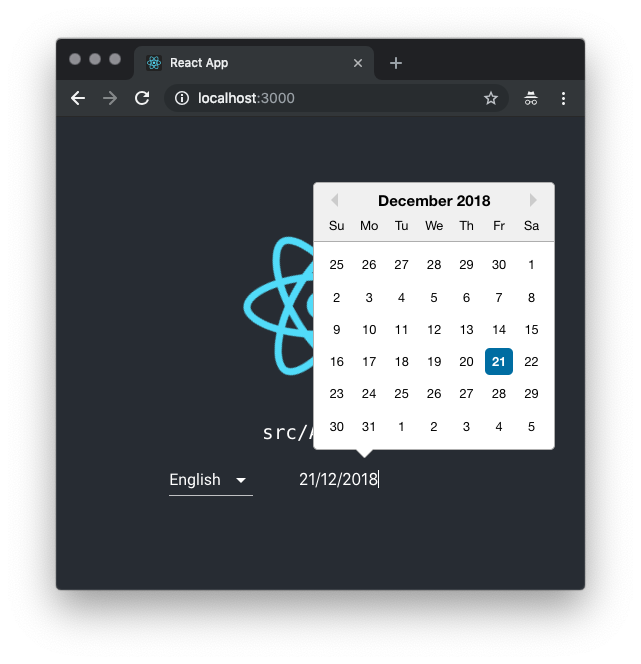
In the ideal world we would have native pickers that support basic theming using CSS for desktop browsers but until that happens I think the best way to go is to use the Material UI Select and a custom Date Picker on desktop, whilst taking advantage of the native selects and pickers on mobile. Fortunately there’s a React device detect component to help with that!
yarn add react-device-detect
Using device detection we are able to provide Adaptive React components that use the native select and native date picker components for mobile and the Material UI Select and the React Date Picker component for desktop in order to provide the best user experience for each platform.
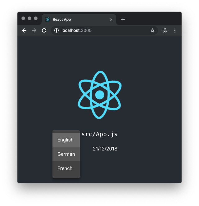
Adaptive Select
Adaptive Date Picker
Sample usage
The following code snippet shows how to provide an initial state for our adaptive select and date picker component and the handler functions for when the user selection changes.
import React, { Component } from "react";
import AdaptiveSelect from "./components/AdaptiveSelect";
import AdaptiveDatePicker from "./components/AdaptiveDatePicker";

class App extends Component {
  constructor(props) {
    super(props);
    this.state = {
      selectedValue: "en",
      selectedDate: new Date()
    };
  }

  handleSelectChange = selected => {
    if (selected === undefined) return;
    // update state
    this.setState({
      selectedValue: selected
    });
  };

  handleDateChange = selected => {
    if (selected === undefined) return;
    // update state
    this.setState({
      selectedDate: selected
    });
  };

  render() {
    const { selectedValue, selectedDate } = this.state;
    return (
      <React.Fragment>
        <AdaptiveSelect
          options={{ en: "English", de: "German", fr: "French" }}
          value={selectedValue}
          onChange={this.handleSelectChange}
        />
        <AdaptiveDatePicker
          onChange={this.handleDateChange}
          value={selectedDate}
        />
      </React.Fragment>
    );
  }
}
The full code is made available in the React Adaptive Components repo.